8 Dec 2008
Thoughts on User Interface
Of all of the areas of computing, I’m most interested in user interaction and user interfaces. Although I can program, I care less about the code (Maybe that’s why so few of my projects make it to fruition!) and more about the design and interface. I’ve been working on a personal backup utility in some of my spare time and while this is generally an area that has very little interface to it I found that the design process of even this little app was extremely interesting.
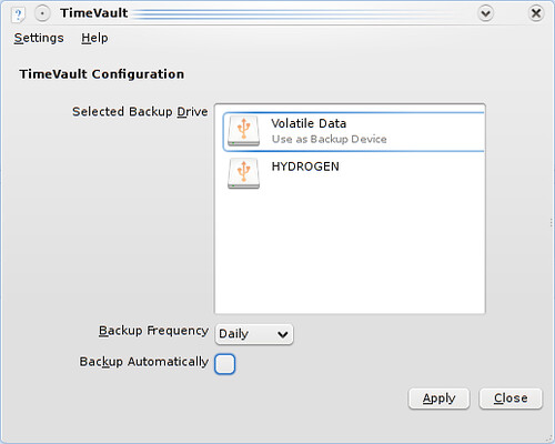
I needed a small preferences interface to let the user choose things such as the destination drive for storing backups, the frequncy of backups, and how long backups were kept. The following image was my first iteration of the preferences window.
If you use KDE4 you might have noticed that the drives view in the window is taken from the “recent devices” plasmoid. I decided that it was a familiar (to KDE4 users) and good way to show devices. When hovered over, the subtext is not “Open with Dolphin” but rather “Use as backup device”.
As cool as the widget is, there were still some flaws with this preferences window. First of all, I needed a separate check box to say whether or not backups were to be taken at all. Additionally, the user only had a choice of Daily, Monthly, Weekly, etc… and not intermediate specifications such as “Every Monday” or “On the 4th day of the month”. And to top it off, there was no way to specify how long to keep backups for. From these problems the second iteration was developed.
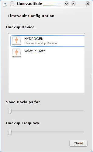
This revision keeps the device selection widget (I really like it), but removes the unnecessary text on the left. Additionally, it adds two sliders at the bottom to specify how long to save backups for and how frequently to take them. But this has its flaws, as there is no feedback to the user for how long backups are actually saved for nor how often they are taken. It’s just an abstract “somewhere on this slider”. So, with feedback in mind, the third iteration was created.
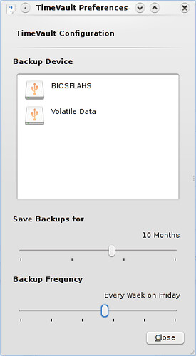
I am mostly happy with this last window. There are tick marks on each slider differentiating between major points (I.E. less than a day, less than a week, less than a year, and less than a decade). Additionally, if you move the slider all the way to the right you get “Forever” which is great way to not have to add an additional checkbox that disables truncating backups. The same logic is applied to the Backup Frequency, which allows specification for sometime within each hour, each day, each week, each month, each year or never. Again, we are spared the expense of an extra check box by having the maximum value on the right be “Never”.
The work needed to create this (relatively simple) preferences dialog is fairly significant and definitely not to be forgotten. It can make the difference between having an app that is simple and clean or an app that is cluttered and unusable.
If you feel like following the progress of TimeVault, it is hosted on launchpad at https://code.launchpad.net/~astromme/timevault/timevault-kde4


